| By John Le (Lilbucu) (24.19.198.100) on Wednesday, February 23, 2005 - 05:15 pm: |
uhhh there is a correlation between what goes into art and the final product.
if you can't tell the difference and recongnize that, i'm not mad at ya, you like what you like, who am i to tell you otherwise?
i just know what i know.
| By Aryl (Aryl) (216.99.204.110) on Tuesday, February 22, 2005 - 05:02 pm: |
"when looking at a "final product" you have to take into account what work was done."
thats art school mumbo-jumbo. the final product should stand up on it own. no matter what went into it. i don't see how aping a kamei label or another tee shirt is any more creative or artistic.
| By John Le (Lilbucu) (24.19.3.158) on Tuesday, February 22, 2005 - 04:33 pm: |
and everybody knows it takes a lot of talent to use filters ;)
| By DON (199.2.139.150) on Monday, February 21, 2005 - 05:47 pm: |
Artistic is an opinion. You can use a pencil, pen, paint OR FILTER to produce something nice or a piece of $hit as Richard purposely displayed. To argue that a filter is inferior is no more correct than saying a pencil is. It just takes talent and an eye. So far from the votes filtered pictures show they are being enjoyed too and isn't that what matters.... keep em coming.
| By John Le (Lilbucu) (24.19.3.158) on Monday, February 21, 2005 - 02:16 pm: |
Chaffneue, and cozla: amen!
what fun is there in just aplying a filter? post those pics in any forum where people know a thing or 2 about photoshop and see what they say.
when looking at a "final product" you have to take into account what work was done. using filters is far from being creative.
in looking at don's argument on photos being better then hand drawn when looking at the "most info" , he forgets the element of creativity and artistic ability.
| By Kurt (205.250.75.226) on Sunday, February 20, 2005 - 01:48 pm: |
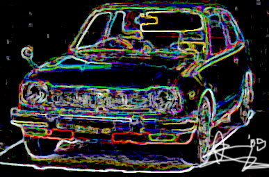
the black and blue one is sweet ![]()
| By shreck (24.112.121.191) on Sunday, February 20, 2005 - 01:35 pm: |
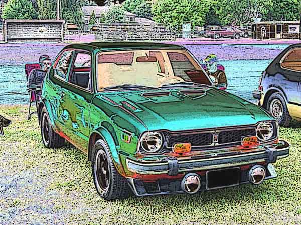
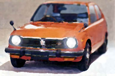
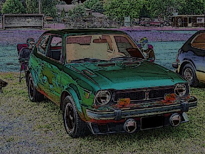
Here is the original brightened up a bit. You can pretty much make it as dark or light as you want. I would have to consider what the graphic is being used for when deciding to make it light or dark. I used photo shop as you have guessed and it is a real time saver as it only took me a short time to do. Those of you luck enough to own a copy I would try all the effects and keep in mine the ones you like the most. Then try a combination of those affects to achieve the appearance that best catches your eye. I found a natural scene works best to get a full figured image with a decent back ground and a stand alone one I found to my liking for a t-shirt graphic.
Here is one of a 78 JDM Civic and the next one is lighten up for those that find the first one too dark. Enjoy.
| By Jarcaf (Jarcaf) (207.55.238.216) on Sunday, February 20, 2005 - 01:20 pm: |
My little sister and I agree that we like John's newer style "Old School" designs as well as DaRk's black background design. Do you have a higher res version of that, DaRk? It appears to be a classic battle of the ages as far opinions and taste are concerned. ![]()
| By Aryl (Aryl) (216.99.192.181) on Sunday, February 20, 2005 - 11:42 am: |
chaf, i didn't write that in a bad mood at all. mabey i should start using emoticons... naaay!!!!
| By Chaffneue (Chaffneue) (66.183.190.188) on Sunday, February 20, 2005 - 11:27 am: |
I thought it was obvious I was kidding around.. guess not..
-Richard
| By Aryl (Aryl) (216.99.192.181) on Sunday, February 20, 2005 - 11:21 am: |
i hate most photoshop filters too. i just felt in this instance, that shreks application was classy and tasteful. chaf, how does that comparision relate? you didn't even try.
i hope no one will take these posts personally.
| By Don (63.135.203.97) on Sunday, February 20, 2005 - 10:38 am: |
Crud Richard I thought the last one was bad! If your realy trying and you spent 3 hrs on that, you had better stick too web pages, maybe shreck can help you out a bit..![]()
| By Chaffneue (Chaffneue) (66.183.190.188) on Sunday, February 20, 2005 - 10:29 am: |
Okay.. I laboured over this for like 3 hours.. I hope you guys like it. it's a limited signed version, which makes it more that perfect for a desktop background.. make sure to use windows' stretch function...
-Richard
| By Don (63.135.203.97) on Sunday, February 20, 2005 - 07:29 am: |
Oh also if you looking for the most info....and "none lost" take a photo...and leave it alone.. what fun is that? Even "Hand drawn" looses out there.
| By Don (63.135.203.97) on Sunday, February 20, 2005 - 07:13 am: |
Quit yer bitchin ![]() your right you have produced the most ugly picture of the thread ...now lets see what you can do proof is in the finished product.
your right you have produced the most ugly picture of the thread ...now lets see what you can do proof is in the finished product.
| By Colza (Colza) (210.54.193.166) on Sunday, February 20, 2005 - 03:42 am: |
By applying a computer effect, you can only lose information. It is not possible for the computer to put in any information that wasnt there to start with, because it has no creative ability of its own, and given that the picture hasnt stayed the same it can only have lost something. How could you possibly take an image, remove some of its goodness, and then claim that you have created something better?
| By Chaffneue (Chaffneue) (66.183.190.188) on Sunday, February 20, 2005 - 02:55 am: |
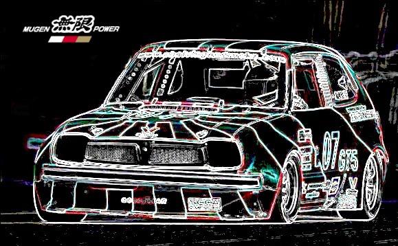
Photoshop filters should be destroyed.. they're ugly as hell.. glowing edges and solarize are terrible filters, friends. They make everything dark and mottled, and select colors from all over the place to make this awful abortion of an output. This is what happens when you let computers design for you. They're not meant to make a final, functional design element. It's cool to use algorithms for finding edges, but only if you go ahead and make something out of it after. Just effecting a picture is kind of weird.. I'd rather have that race picture printed on a shirt than the efected version of it. Thought I'd apply almost all the filters in photoshop just to show you what I mean.
What would you rather see?
-Richard
| By Aryl (Aryl) (216.99.198.43) on Sunday, February 20, 2005 - 01:24 am: |
the term "detail" is kind of like the term "tone". you just don't like the lack of clarity in the image. there is alot of detail in that picture, its just not true to the original. we're talking efficency at this point. noise can be really good sometimes.
| By Canada76civic (Canada76civic) (68.146.192.75) on Saturday, February 19, 2005 - 09:42 pm: |
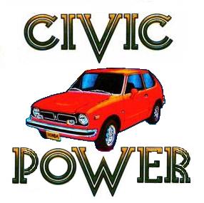
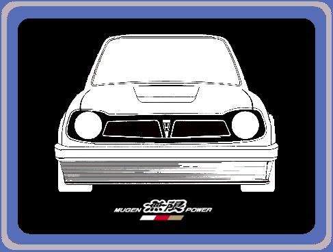
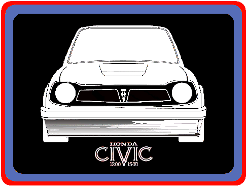
Hmm... so far I like Don's "Mugen Power" image and "Civic Power" image. They have a kind of retro-'70s look. Maybe someone could try a design with 2 or 3 models as a group - like what you see for muscle cars and street rodders designs on t-shirts (quite popular around).
One sedan, one wagon and one hatchback should round up as a group...what you think? ![]()
| By Jamie Lay (Boyracer) (24.125.12.123) on Saturday, February 19, 2005 - 07:41 pm: |
| By Don (63.135.203.97) on Saturday, February 19, 2005 - 05:24 pm: |
I dont think most people care if someone used a filter.... only the finished product is judged and I vote for Shrecks it looks kind of like a painting to me. Peoples opinions on the best one will vary but I think the cool thing is that so many have poped up in the last week. So whos posting next?
| By John Le (Lilbucu) (24.19.198.100) on Saturday, February 19, 2005 - 04:32 pm: |
i dunno, what you see as detail, i see as noise.
hows this for "hand drawn" http://students.washington.edu/lilbucu/wholeidea.jpg
this one is acually hand drawn (not just a filter).
| By John Le (Lilbucu) (24.19.198.100) on Saturday, February 19, 2005 - 04:27 pm: |
don, i had no intention of not sharing, you are the one talking smack about how i didn't do anything. get your facts stright.
| By Aryl (Aryl) (216.99.198.4) on Saturday, February 19, 2005 - 04:23 pm: |
i think shreks is the most intersting submission, so far. i like the detail. looks almost hand drawn. i'm not really a fan of the skate shirt style.
| By Don (199.2.139.208) on Saturday, February 19, 2005 - 04:12 pm: |
There you go... see it doesn't hurt to share ![]()
| By John Le (Lilbucu) (24.19.198.100) on Saturday, February 19, 2005 - 04:06 pm: |
and here is the link to the orginal scan if any one else want to mess around:
http://students.washington.edu/lilbucu/original.psd
| By John Le (Lilbucu) (24.19.198.100) on Saturday, February 19, 2005 - 04:03 pm: |
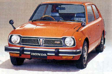
i like that one you found Ed, very retro.
dark, i like the lip kit your put on it. whos civic is in your second post? looks nice and low.
i always thought the speednation one looked very mean, pretty cool style.
shreck, i think that the filter you used takes away from the orinal picture, its too dark , and you loose detail. the filter don used is pretty cool, but played out.
i think i just realized that the majority of the 1st gen civic owners are way older than me, and have a "different" sense of style. I'm not saying i have better taste, but what can i say, i'm just a young hip kid.

| By DaRk (66.50.182.84) on Saturday, February 19, 2005 - 08:00 am: |
| By Aryl (Aryl) (216.99.192.154) on Friday, February 18, 2005 - 11:27 pm: |
i like shreks too. i'm not down with the rectangle on a shirt. i would cut out just the civic with the two people and put that on a solid color. mabey even the cut out ass end of the other civic in the same spacing. and big.
no honda. no civic.
shrek, did you do that in photoshop? thats a really neat effect.
| By Don (63.135.203.97) on Friday, February 18, 2005 - 10:50 pm: |
I like that one!
| By shreck (24.112.121.191) on Friday, February 18, 2005 - 07:47 pm: |
I thought I would have a crack at it, I am not really interested in a t-shirt design but did it just for the heck.
wall paper size pictures
| By jms (68.19.238.45) on Thursday, February 17, 2005 - 07:41 pm: |
check it out... 
| By jms (68.19.238.45) on Thursday, February 17, 2005 - 07:40 pm: |
or you could go get the speednation one... 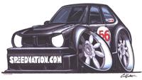
| By DaRk (66.50.182.147) on Thursday, February 17, 2005 - 12:15 am: |
I could do better that's just a test ![]() Hope You guys like it... I could do it in any color...with any flares...will come up with more ideas in these days...stay tuned :-P
Hope You guys like it... I could do it in any color...with any flares...will come up with more ideas in these days...stay tuned :-P
| By DaRk (66.50.182.147) on Thursday, February 17, 2005 - 12:13 am: |
| By DaRk (66.50.182.147) on Thursday, February 17, 2005 - 12:12 am: |
I have something done...but I need to know how to post..![]()
| By Max (Max) (24.1.225.244) on Wednesday, February 16, 2005 - 06:18 pm: |
hey john
can you send me the original scan?
i like drawing and think i could fart around with it!
that is if you dont mind
ill only keep it for my art work!
thanks
max
gldodd@comcast.net
| By Jamie Lay (Boyracer) (24.125.12.123) on Wednesday, February 16, 2005 - 04:29 pm: |
i printed that last "honda civic" pic on some tshirt paper and ironed it on a shirt for my 19 month old...SHE LOVES IT!!! too bad my camera's down...but anyways, thought id share.. also i taught her how to say "honda", well, it sounds more like "honey" but hey... hondas ARE sweet, right?
jamie
| By Kyle Thomson (24.83.29.123) on Tuesday, February 15, 2005 - 02:36 pm: |
Here's one for the accord lovers
http://cgi.ebay.com/ws/eBayISAPI.dll?ViewItem&category=28022&item=8170131962&rd=1
| By Dave (216.209.113.90) on Tuesday, February 15, 2005 - 04:44 am: |
You can go to a T shirt place and they will just photo copy it and put it on a shirt.
Could you send me a good rez copy of that so I could mod it and make it my own? Thanks here is my email dave.britt@sympatico.ca
| By Kyle Thomson (24.83.29.123) on Monday, February 14, 2005 - 11:25 pm: |
Hey Ed, did you buy that off ebay? I got one, but I have no idea how to get it on a shirt, it says to use a professional T-shirt press. And silly me, I left it in my other pants =)
I was trying to think of a way that I could scan it and just use the iron on paper. But it would need to be transfered to something first, otherwise it will be mirrored/seen through the wax paper
| By Ed (24.100.5.141) on Monday, February 14, 2005 - 10:51 pm: |
here's one:
| By shreck (24.112.121.191) on Monday, February 14, 2005 - 08:13 pm: |
Don
Hey thanks for the pictures, they are on this page: http://www.1stgencivic.com/newsite/desktop_pictures.html
They will look superb on a black t-shirt.
| By Edgar F Sanchinelli (Frito) (66.154.186.24) on Monday, February 14, 2005 - 02:58 pm: |
i'm thinking of rodney king's words right now...
frito
| By DaRk (66.50.181.25) on Monday, February 14, 2005 - 07:31 am: |
Hey Guys I'm somewhat good at photoshop, could I have a swing at this? ![]()
| By John Le (Lilbucu) (24.19.3.158) on Monday, February 14, 2005 - 02:02 am: |
btw, you can alter all you want, but one thing you lack is taste.
| By John Le (Lilbucu) (24.19.3.158) on Monday, February 14, 2005 - 02:01 am: |
don, i don't think you understand. you started of with my pic. try starting off with the original scan if you're so fond of yourself.
| By Don (216.104.65.172) on Sunday, February 13, 2005 - 09:07 pm: |
I sent the last one to Randy (shreck) maybe he will start a desktop area on his site for Civic fans ![]()
| By Anthony Stewart (203.173.8.223) on Sunday, February 13, 2005 - 08:57 pm: |
Hey, you Girls, I didnt complain, was sent to me, and deleted as Spam, as didnt recognise the sender, I have it now, max respet for it being sent to me.. Love to try to get it on a Shirt, If I am capable..
Stop your Whining Lads
| By Don (216.104.65.172) on Sunday, February 13, 2005 - 08:43 pm: |
Dont Pinch! Its mine ![]()
| By Don (216.104.65.172) on Sunday, February 13, 2005 - 08:01 pm: |
John, you still dont get it I changed it so it makes it mine ![]() Its the same thing you did with the Kamei drawing..... If it bothers you so much fix it up a bit and post it so others can play too
Its the same thing you did with the Kamei drawing..... If it bothers you so much fix it up a bit and post it so others can play too ![]()
As for your name calling ...Ive been called worse (lol)
| By John Le (Lilbucu) (24.19.3.158) on Sunday, February 13, 2005 - 07:54 pm: |
and maybe someday you might shut up a bit, i know many agree with me.
| By John Le (Lilbucu) (24.19.3.158) on Sunday, February 13, 2005 - 07:51 pm: |
looks like crap. i honestly feel sorry for you.
| By Don (216.104.65.172) on Sunday, February 13, 2005 - 07:25 pm: |
It makes a good desktop... streched and centered. ![]()
| By Don (216.104.65.172) on Sunday, February 13, 2005 - 07:22 pm: |
| By Don (216.104.65.172) on Sunday, February 13, 2005 - 04:59 pm: |
John I dont have time to trade insults Grow up and do the right thing, who knows maybe someday Anthony can return the favor. ![]()
| By John Le (Lilbucu) (24.19.3.158) on Sunday, February 13, 2005 - 04:50 pm: |
like i said, wow you are an ass.
| By Don (63.135.203.186) on Saturday, February 12, 2005 - 07:33 pm: |
Just send him the files like he asked instead of ignoring him and all will be forgiven.
| By John Le (Lilbucu) (24.19.198.100) on Saturday, February 12, 2005 - 06:38 pm: |
don why are you such an ass sometimes? what the hell is wrong with YOU, i didn't even notice the post. and if you didn't notice i said i wasn't done with it, in fact i'm still working on it. you come off as the most pompous prick on the whole board. i'm not saying you don't know your sh1t, you do, but you can be such an ass and very snide.
i won't go into the details, but more work was put in then you know/understand or care about. it most certainly took more then an hour and i for sure contributed more than "10%" of the graphic.
how about i send you the original scan and see what you can come up with and how long it take you. alot of work goes into transfering something from a scan to a production piece.
it bothers me that you are so quick to talk down to me on something you seem to have no clue about.
all it would have taken is a simple email to me insted of you trying to be a "hero". YAY great work don. that would have been "the right thing" to do. if you own the original wrapper and wanted to "help" why didn't you just scan that? instead you took my skribbled pic and removed the lines (doing a crappy job i might add).
and who even said i wanted money? i was just going to make myself a t shirt and just wanted to show others my work. but i would be pissed if someone DID take my design and started selling copies of it. the reason its skribbled is that i posted it on other forums where i cannot control where it might end up.
thanks everybody else for the nice comments. anthony, i've sent you a full copy with an appropriate subject, have fun! let me know what you come up with. i still have some ideas i'm playing with. (i've edited either new or old style hood vents or grills or blinker styles! and i'm working on a graphic for the rear of the car that will go on the back of the t shirt!) by the time i am done, i'll be able to "build" a civic with either style hoods, blinkers, mirrors, or grills. and be able to alter ride hight, tire width and customizable licence plates.
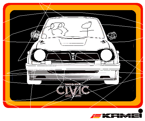
| By Don (63.135.203.231) on Saturday, February 12, 2005 - 03:56 pm: |
A little more work and a format change and it should be good enough for a T
| By Don (63.135.203.231) on Saturday, February 12, 2005 - 03:54 pm: |
| By Don (63.135.203.231) on Saturday, February 12, 2005 - 03:12 pm: |
I didn't do the art work I just have an original wrapper. John what's wrong with you? Send the guy a copy! Its not like he is going to buy one from you being in Oz and all. It would be different if it was original art work but its 90% stolen from the Kamie logo.
So you spent an hour on Photoshop... there are a lot of us that spend time figuring out stuff for our civics and don't demand payment for the help we provide on this board.![]() Do the right thing!
Do the right thing!
| By Anthony Stewart (203.173.8.223) on Saturday, February 12, 2005 - 02:38 pm: |
No I didnt, I delete mail sent without "Appropriate" subjest heading, could you please email again and put Honda Civic in Mail Subject.
Bloody great work with pic you Did, lopve to get that screenprinted on a shirt and go to Ford or GM car shows ![]()
| By Don (63.135.203.212) on Friday, February 11, 2005 - 07:03 pm: |
Anthony did you get your copy ? If not I think I have a wrapper lying around.
| By sonymmx200 (208.54.15.129) on Friday, February 11, 2005 - 03:38 pm: |
I'd love to have this design on a nice yellow T-shirt. hope you can get it done soon. I'd love to have it ![]()
| By Jason (Jason) (152.163.100.199) on Monday, February 07, 2005 - 01:34 am: |
I like that design, your going places. I especially like the driver , looks like a real racer.lol
| By Anthony Stewart (203.173.8.223) on Sunday, February 06, 2005 - 07:20 pm: |
Tidy work, Fat tyres too, look good with mirrors done good, can u throw me a copy and I will have a play with it, dont want to pinch it.
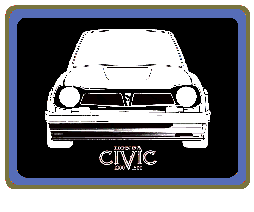
| By John Le (Lilbucu) (24.19.198.100) on Sunday, February 06, 2005 - 05:56 pm: |
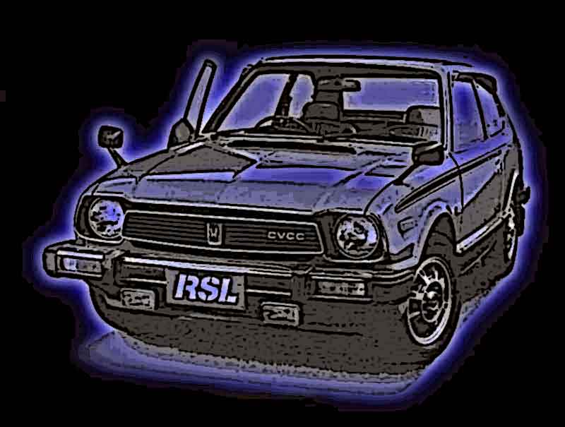
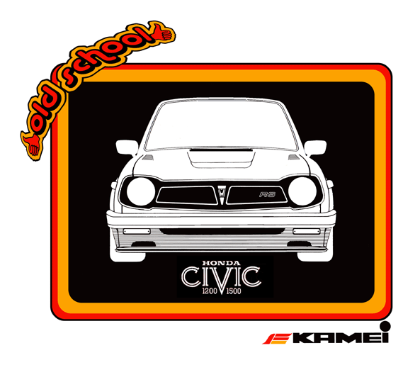
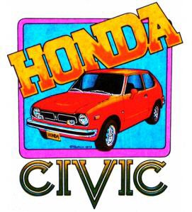
thats where i got the graffic from ![]() here is the original, notice the changes.
here is the original, notice the changes.
| By Don (63.135.203.92) on Sunday, February 06, 2005 - 05:32 pm: |
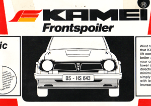
That looks like the Kamie label...you get it when you by an air dam
| By John Le (Lilbucu) (24.19.198.100) on Sunday, February 06, 2005 - 05:26 pm: |
i havn't added mirrors yet.
| By John Le (Lilbucu) (24.19.198.100) on Sunday, February 06, 2005 - 05:25 pm: |
i was bored and started making this: took me about 3 hours so far. i skribbled over it so no one would steal it, i have .psd version with all the layers and everything. what do you guys think?
| Administrator's Control Panel -- Board Moderators Only Administer Page |